Great moments in bad graphics history
Amateurs and professionals alike can learn more from bad examples than from paragons of perfection.
Rob James
May 10, 2026
For some years I have kept examples of graphic or typographic presentation I found amusing or perplexing (or amusing). Until today, I forgot I had an easy way of sharing them. They should be self-explanatory—indeed, their shortcomings are self-explanatory. Without further auf Wiedersehen, baby, enjoy!
Chapter 1. The Uninformative Table of Contents
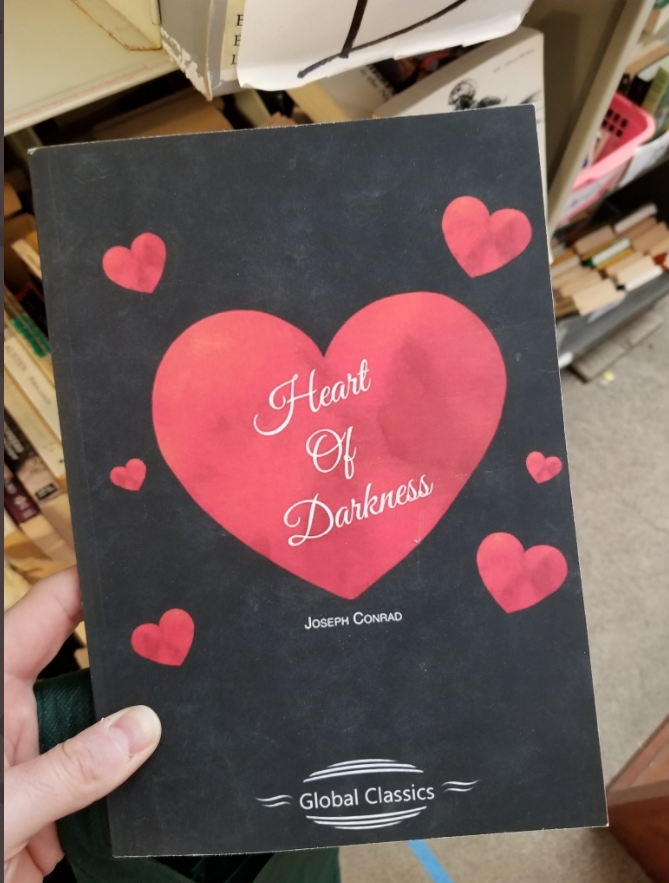
Chapter 2. The book cover designed by someone who clearly hadn’t read the book.
Chapter 3. The misplaced bar-code sticker obscuring the important words “DO NOT.”

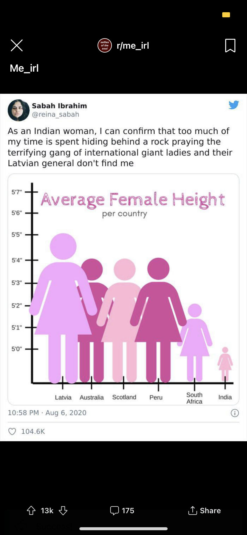
Chapter 4. The Giant Latvian Woman and the cowering Indian woman. (With thanks to Princeton computer scientist Brian Kernighan, author of the brilliant book Millions, Billions, Zillions: Defending Yourself in a World of Too Many Numbers (2018).)
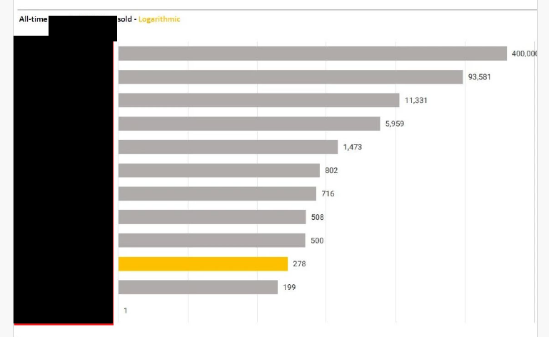
Chapter 5. The market shares presented on a logarithmic scale (so distances are exponential, not linear). “Hey, we are right behind the market leaders!”
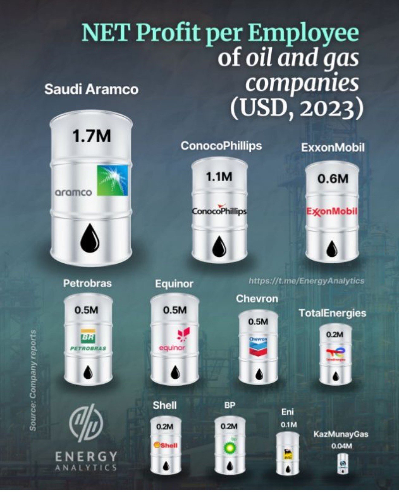
Chapter 6. Use of graphic pictures rather than data points—and the same data are given a differently sized picture based on a different metric.
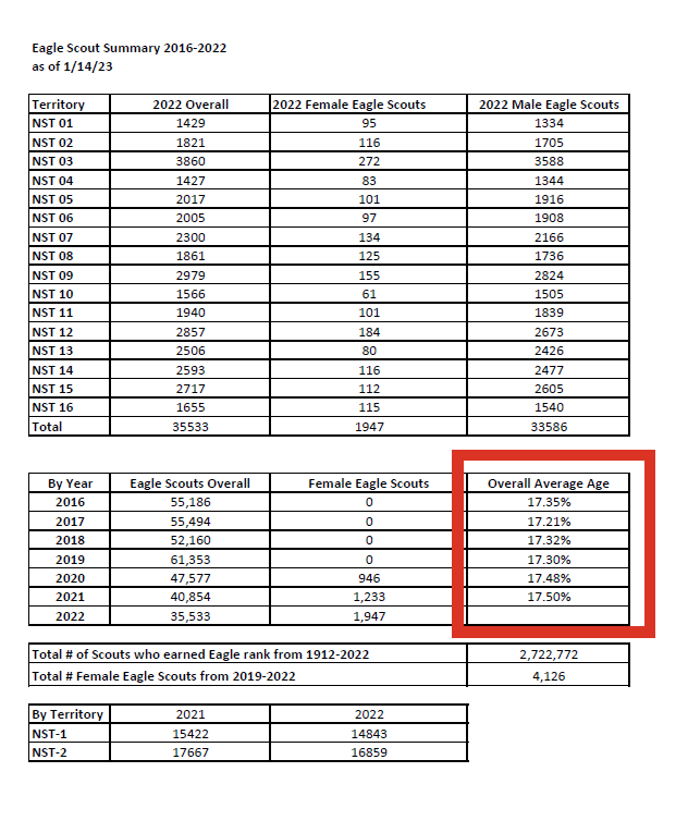
Chapter 7. Ages of 17-year-old boys and girls expressed as percentages of a 100-year-old (even beyond the Bible’s “three score and ten” (Psalms 90:10)).
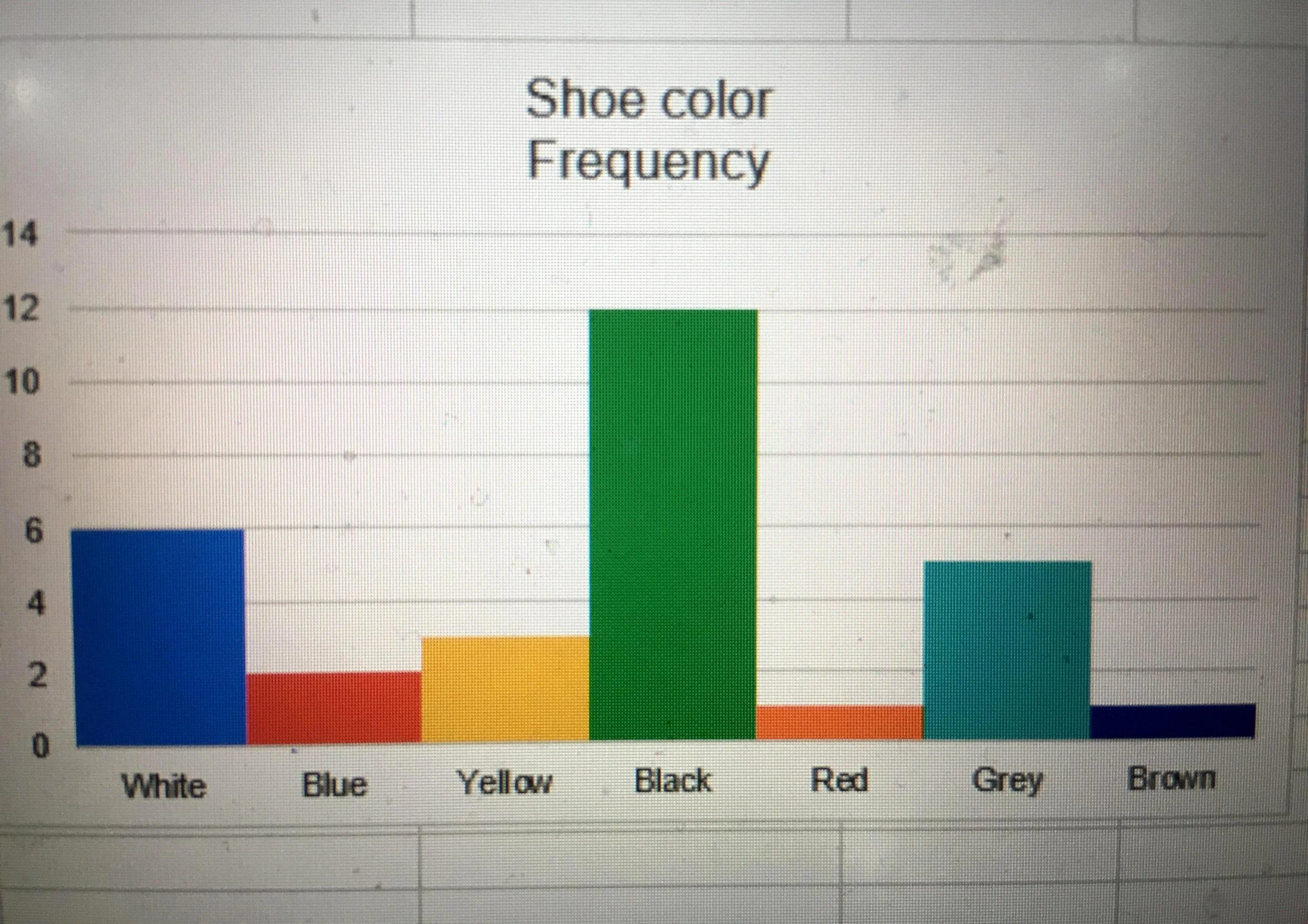
Chapter 8. Color coded charts are very useful in clear communications.
Chapter 9. And here is my own contribution, directly caused by my trying to appear smart and translate Latin. The Welsh example is a classic cautionary tale about guessing foreign languages!

Needless to say but I’ll say it anyway, I welcome additions to this list—by any communications means whether possible or necessary.